
Ever opened a new prescription and thought, Why does this label look nothing like the last one? You’re not imagining it. One month, your pill bottle has bold, clear instructions in large print. The next, it’s cramped, tiny text with medical jargon you don’t understand. The reason? There’s no single rule for how prescription labels must look in the U.S. Even though safety experts have agreed on the best way to design them for over a decade, your pharmacy might still be using an outdated format - and that’s not just annoying, it’s dangerous.
Why Prescription Labels Vary So Much
The FDA sets rules for how drug manufacturers write professional labeling - the thick booklets doctors and pharmacists use. But when it comes to the little paper sticker on your bottle? That’s a different story. The United States Pharmacopeial Convention (USP) released clear, evidence-based guidelines in 2012 called General Chapter <17>. These standards say labels should use simple language, sentence case (like this), sans-serif fonts like Arial, high contrast (black on white), and 1.5 line spacing. They also insist on including the reason you’re taking the medicine - not just the drug name. So instead of "Take one tablet daily for hypertension," it should say, "Take one tablet daily for high blood pressure." But here’s the catch: USP’s rules are voluntary. Each state’s board of pharmacy decides whether to adopt them. As of 2023, only 28 states have fully embraced these standards. Texas requires a minimum 10-point font size and mandates the pharmacy’s phone number be printed in a specific way. California demands bilingual labels for certain drugs. Other states don’t even require the reason for the prescription to be listed. That’s why your label might look totally different if you fill the same prescription at CVS in Texas versus Walgreens in California.What’s Actually Required on a Prescription Label
Federal law only forces pharmacies to include a few basic things: your name, the drug name, dosage instructions, the prescribing doctor’s name, the pharmacy’s name and address, and the dispense date. Everything else? Up for grabs. That’s why some labels include refill info, warnings, or even QR codes - while others leave those out. The FDA doesn’t regulate the layout, font, or readability of the patient-facing label. It only cares that the information is accurate. It doesn’t care if you can read it.How Pharmacy Systems Make It Worse
Even if two pharmacies in the same city use the same state rules, their labels can still look different. Why? Because they’re using different pharmacy management software. There are about a dozen major systems in use across the U.S. - each with its own default label template. One system might put the dosage instructions at the top. Another might bury them in the middle. One uses bold for warnings. Another uses italics. A 2022 survey of pharmacy technicians found that 73% had customers return because the label format changed between refills, even at the same pharmacy chain. Imagine taking a blood thinner because the label suddenly switched from "1 tablet twice daily" to "Take 1, 2x a day" - and you misread it. That’s not hypothetical. It’s happened.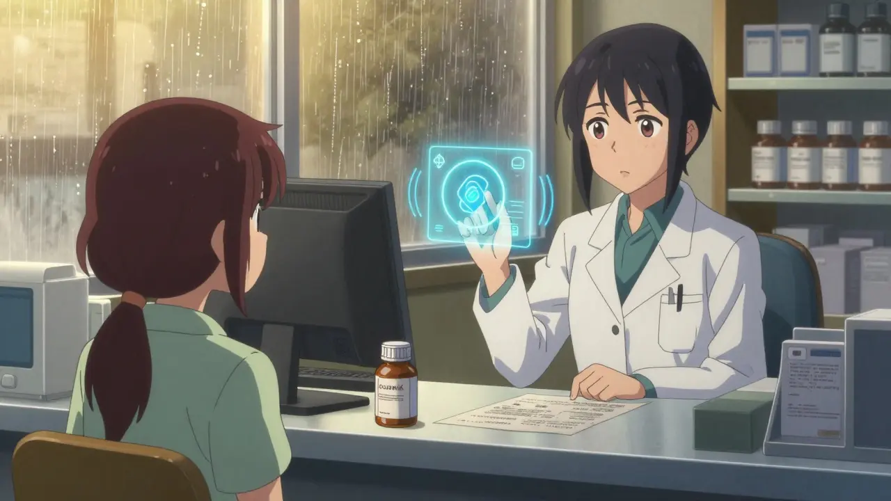
The Real Cost of Confusing Labels
It’s not just about confusion. It’s about harm. The Institute of Medicine estimates that medication errors cause at least 1.5 million preventable injuries each year in the U.S. And inconsistent labels are a major contributor. Dr. Michael Cohen of the Institute for Safe Medication Practices says name confusion and unreadable labels are the top two reasons people take the wrong dose. Research shows that if all labels followed USP <17> standards, medication errors could drop by 30 to 40%. A 2021 study in the Journal of the American Pharmacists Association found that pharmacies using standardized labels saw a 27% drop in patient calls asking for clarification - and a 19% improvement in people taking their meds correctly.Patients notice this too. A 2021 survey by the National Community Pharmacists Association found that 68% of people have trouble understanding their prescription labels at least sometimes. Over 20% say they’ve made a mistake because of confusing wording or layout. One Reddit user shared how they took double their blood thinner dose after a refill label changed format. Another said they skipped doses because the label didn’t say why they were taking the pill - they thought it was for a cold, not for heart failure.
What’s Being Done to Fix It
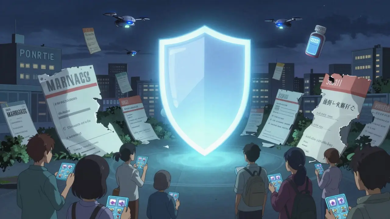
The good news? Change is coming - slowly. CVS Health announced in April 2023 that it will roll out USP <17> labels across all 10,000+ of its pharmacies by the end of 2024. That’s over 100 million prescriptions a year. They ran a pilot in 500 stores and cut label-related customer calls by a third. The Biden administration’s 2022 Patient Safety Action Plan set a goal of 90% state adoption of standardized labeling by 2026. The FDA also issued draft guidance in June 2023 suggesting it might one day require standardized formats - but that’s still years away.Meanwhile, the industry is adapting in other ways. Apps like Medisafe and MyTherapy now scan your physical label and turn it into a clean, consistent digital version with reminders, explanations, and even voice readings. Smart pill bottles with Bluetooth and LED lights are also becoming more common - they don’t rely on paper labels at all.
What You Can Do Right Now
You don’t have to wait for the system to fix itself. Here’s what to do the next time you pick up a prescription:- Ask for a plain-language version. Say: "Can you print this in larger text with the reason for the medicine written out?" Most pharmacists will do it - especially if you mention you’re having trouble reading it.
- Check for accessibility options. Many pharmacies offer large-print, braille, or audio labels. Only 38% offer large print consistently, but you have to ask. Don’t assume they’ll offer it.
- Compare labels across refills. If the layout changes, pause. Double-check the dosage with the pharmacist. A change in format could mean a change in instructions.
- Use a pill organizer with printed labels. Write out your instructions in your own words and tape them to the organizer. If the bottle says "Take 1 tablet by mouth daily," write "Take one pill every morning for blood pressure."
- Ask about the reason. If the label doesn’t say why you’re taking the medicine, ask. "What is this for?" is a perfectly normal question.
The Future of Prescription Labels
The future won’t be paper labels at all. It’ll be digital. Apps that sync with your pharmacy, smart packaging that glows when it’s time to take a pill, voice assistants that read your meds aloud. But until then, the paper label is still your main source of truth. And right now, it’s a mess.There’s no excuse for this. We know how to make labels safe. We know how to make them clear. We know how to make them work for people with vision problems, low literacy, or who speak languages other than English. The technology and standards have existed since 2012. What’s missing is the will to enforce them.
Until every pharmacy in every state uses the same clear, simple, patient-first format - your safety depends on you asking questions, checking details, and refusing to accept confusing labels as normal.
Why do prescription labels look different at different pharmacies?
Because there’s no federal law requiring a standard format. Each state’s pharmacy board sets its own rules, and pharmacies use different software systems that generate labels in different layouts. Even if two pharmacies follow the same state rules, their label templates can still look completely different.
Is there a national standard for prescription labels?
Yes - the USP General Chapter <17> standards, released in 2012, are the gold standard for patient-friendly labeling. But adoption is voluntary. Only 28 states have adopted them fully, and only 15 have implemented them completely. Most pharmacies still use outdated formats.
What should a good prescription label include?
A clear, easy-to-read label should include: your name, the drug name, dosage instructions in plain language (e.g., "Take one pill every morning"), the reason for use (e.g., "for high blood pressure"), the dispensing date, the pharmacy’s contact info, and refill instructions. It should use a sans-serif font like Arial, black text on white background, 1.5 line spacing, and no condensed or italicized text.
Can I ask for a larger print label?
Absolutely. All pharmacies are required to provide accessible label formats upon request, including large print, braille, or audio. Many don’t offer them proactively, so you need to ask. If they refuse, you can file a complaint with your state’s board of pharmacy.
Why doesn’t the FDA require standardized labels?
The FDA regulates the scientific content of drug labels for healthcare professionals, not the patient-facing container labels. They’ve never had the authority to enforce how pharmacies format the sticker on your bottle. That’s left to state pharmacy boards, which have been slow to act due to cost and complexity.
 Medications
Akshaya Gandra _ Student - EastCaryMS
January 4, 2026 AT 22:41ok so i just got my blood pressure med and the label said 'take 1 tablet daily' but no reason why?? i thought it was for headaches lmao. i had to call the pharmacy. why is this even a thing??
Jacob Milano
January 5, 2026 AT 03:07Man, I’ve been taking meds for 12 years and this is the first time I realized how wild it is that the same pill can come with a novel on one label and a fortune cookie on another. It’s like the pharmacy’s printing labels using a random generator. I started writing my own instructions on masking tape and sticking it to the bottle. My grandma thinks I’m weird, but I’m alive, so… win?
Cassie Tynan
January 6, 2026 AT 13:43Of course the system’s broken. The FDA doesn’t care if you go blind reading your label as long as the chemical formula is correct. It’s not negligence-it’s capitalism dressed in white coats. They’d rather you die quietly than spend a dime fixing a system that doesn’t generate revenue. And don’t even get me started on how pharmacies treat patients like walking QR codes.
en Max
January 7, 2026 AT 15:20It is, indeed, a profoundly concerning systemic failure that the United States Pharmacopeial Convention’s evidence-based guidelines-designed to mitigate medication error rates through typographic clarity, lexical simplicity, and semantic transparency-have been adopted by fewer than one-third of state pharmacy boards. The absence of federal enforcement, coupled with heterogeneous pharmacy information systems, creates a fragmented, high-risk environment wherein patient safety is subordinated to operational convenience. One must question the ethical integrity of an industry that prioritizes cost-efficiency over cognitive accessibility.
Joseph Snow
January 9, 2026 AT 12:00Let me guess-the next thing they’ll tell us is that ‘standardized labels’ will be mandatory… right after they start charging $20 extra per script for ‘easy-to-read’ versions. This is just another corporate scam to make us pay more while pretending they care. I’ve been getting the same label for 8 years. It’s fine. People just need to learn to read. If you can’t decipher ‘take one qd,’ you shouldn’t be on meds.
Doreen Pachificus
January 10, 2026 AT 01:02I noticed my label changed last month-even though I filled it at the same CVS. The font got smaller, the reason disappeared, and the QR code now points to a survey. I scanned it. It asked if I was satisfied with my label. I’m not. But I didn’t get a refund.
Angie Rehe
January 11, 2026 AT 10:34Why do you think they don’t standardize? Because they want you to mess up. Think about it-med errors mean more prescriptions, more visits, more profits. The whole system is rigged. I’ve seen pharmacists roll their eyes when I ask for a bigger font. They don’t want you to understand. They want you dependent. And if you die? Well, that’s just another statistic in their quarterly report.
Michael Rudge
January 11, 2026 AT 20:24Wow. You actually think this is a problem? The fact that you can’t read a tiny label means you probably shouldn’t be driving, let alone managing your own medication. Maybe if you didn’t spend all day scrolling TikTok, you’d have better eyesight. Also, ‘plain language’? What’s next? Pills with emojis? 🌈💊
Catherine HARDY
January 13, 2026 AT 07:37Have you ever wondered if these label changes aren’t random? What if it’s not software-it’s surveillance? Every time your label changes format, they’re tracking how long you take to read it. How often you call the pharmacy. Whether you skip doses. They’re building a behavioral profile. And soon, your insurance will adjust your rates based on how ‘compliant’ your label-reading habits are.
Enrique González
January 14, 2026 AT 09:44I used to be frustrated too-until I started asking for the large-print version every time. Now I get it every time. The pharmacist even started writing ‘for heart’ next to my pill name. It’s not perfect, but it’s human. And that’s the real fix: asking. Not waiting for the system to change. You’re not powerless. Just speak up.